Using Color Psychology to Choose the Best Branding for Your Business
The right colors can increase brand recognition and influence buying decisions. Learn how to harness the power of color psychology
A logo is often considered the “face” of a business. When they're well-designed, logos can create brand familiarity that leads to loyalty and trust.
You can always spot Nike shoes by the "swoosh" on the side, and McDonald’s golden arches make your mouth water from a mile away. This type of brand recognition proves the power of a well-crafted logo—but what makes them so recognizable?
Aside from the actual imagery, color is one of the most important and identifiable aspects of an effective logo. Read on to learn how you can harness the power of color.
What Is Color Psychology?
Color psychology is the study of color as it relates to human behavior. More specifically, color psychology analyzes how colors influence our perception of something.
To put it simply, color helps to inform consumers about the personality of a product, service, or business.
According to ColorPsychology.org, the proper use of color increases brand recognition by 80%. Even more shocking: about 85% of consumers buy a product based on its color!
Colors can make your logo or product attention-grabbing, unique, and memorable—three things every marketer or business owner strives for. Once you understand the impression that certain colors create, you can craft a logo and color palette that compliments your business.
Color and Brand Recognition
Above all, you want your logo to accurately portray your company's personality and appeal to your target audience.
Let’s take a look at these two Barbie logos, for example:

The black Barbie logo has little to do with the personality of the Barbie brand. Barbie dolls evoke fun, movement, and femininity. The stark boldness is too dark and unwelcoming—the opposite of the feelings that Barbie as a brand should conjure up.
The candy pink Barbie logo exudes playfulness and energy. It’s known as "Barbie pink" for a reason! Although the Barbie brand is strong enough for us to recognize the logo—even when it's using the wrong color—the pink creates a feeling that's missing from the black version.
Let’s look at another example:
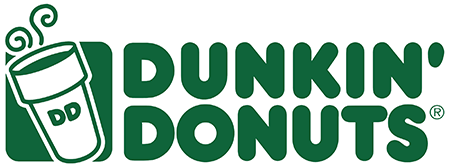
We recognize this as the Dunkin’ Donuts logo because we've seen it countless times: the stacked words, the bubbly letters, the coffee cup...but something is off.
This visual emphasizes two things: the strength of Dunkin’s logo, and the relation between color and personality. We know we're looking at Dunkin' Donuts, even though the color is all wrong. We also notice that the dark green makes Dunkin’ seem less sweet and approachable.
Dunkin’s signature orange and pink logo colors are playful and light, just like their famous sprinkled donuts. When you walk into a Starbucks, it’s a completely different environment: calm music, spacious seating, a lengthy menu of complicated drinks. Overall, it’s a more sophisticated and exclusive vibe.
Starbucks’ green and white colors are more composed, chic and, well, expensive. Dunkin’s orange and pink comes across as accessible, which accurately represents the contrast in cost between the two coffee companies.
Patterns Across Industries
Are there patterns between color and company niches? Absolutely.
Take a look at social media platforms. What do Facebook, Twitter, LinkedIn, Tumblr, Behance, and Skype have in common? A blue logo.
Even Instagram’s old logo was blue, remember?
Why is this? What does it mean when we find patterns within a certain niche? Let’s use what we know of color psychology to better understand this repetition.
According to Bluleadz, the color blue is trustworthy, reliable, calming, dependable, and universally liked. In fact, blue is the world's most popular color and is equally appreciated by both men and women. The color blue also complements other colors and is less distracting than vibrant colors like orange.
This makes for smoother communication and usability. Overall, blue is safe, subtle, and a good default color for most businesses when properly executed.
You might have noticed that green often represents wellness and healthy living:

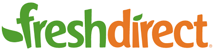
Bio Food, FreshDirect, and Whole Foods are brands that promote healthy eating choices. You can probably think of several more “healthy” brands that use green in their color schemes.
Many consumers feel that black represents a professional, sleek, or authoritative personality.

The New York Times, Nike, and CBS are all well-respected giants within their niches. These three logos are simple, memorable, and wordless. We can recognize them without having to see a company name attached, or a specific color usage.
Strong, bold logos can foster trust in a company. They are balanced and in control.
Common Color Associations
Although the perfect color for your brand is more dependent on supporting your brand’s personality and less about evoking emotions, it’s important to be aware of underlying cultural and brand associations.
Blue
Blue is trustworthy, tried and true. If you’re on the fence about what color to choose for your logo, blue is always safe. Just make sure your market isn’t oversaturated with blue logos, because it’ll be harder to stand out from the crowd!
Green
Green often represents health and growth, much like plants. Animal Planet and Whole Foods are two companies that remind us of all things “natural” and organic. Green can also represent money, although it usually accompanies savings or tracking rather than a financial institution.
Purple
Purple can represent creativity, indulgence, and unique vision. Brands like Cadbury, Taco Bell, and Roku really know how to pull off a purple logo.
Black
Black is classic. It's simple, sophisticated, and often chic. Think luxury fashion brands like Chanel, Dolce & Gabbana, and Oakley. It also says solid and reliable, as in the case of Sony and Uber.
Yellow
This bright color is often associated with optimism and communication. Think Snapchat, Sprint, and National Geographic. Yellow can be very attention-grabbing; just make sure you don't put it on a white background!
Pink
Pink conjures up feelings of fun, energy, and romance. Think about brands like Baskin-Robbins, T-Mobile, and Victoria’s Secret.
Red
Red can stimulate a sense of urgency, which is often used to advantage by brands who sell consumable items. Some famous red logos include Coca-Cola, Texaco, CNN, and Target.
While choosing colors for your logo might seem intimidating, you now have the tools to make the process sensible and simple. The “right” color for your brand is one that does the following:
- Portrays your brand's personality
- Speaks to your target audience
- Accurately represents what your brand sells or provides as a service
If you’re overwhelmed, remember that you can always hire a graphic design team for help!
With these color psychology tips, you can rest assured that your marketing efforts are in order and enjoy your new, strategically-designed business logo.