
It happens all the time: someone will browse your online store, add things to their cart, begin the checkout process then, poof—disappear. Unfortunately, cart abandonment is very common in ecommerce. In fact, according to a study conducted by Baymard Institute, the average rate of abandoned shopping carts on ecommerce sites is about 70%. Fortunately, there nuggets of wisdom we can gather from cart abandonment studies that can help us reduce cart abandonment on ecommerce sites. Here are a few site elements to consider implementing onto your online store to reduce cart abandonment.
Eliminate Shipping Surprises
It’s best to be as transparent as possible when it comes to your shipping costs. Nothing is more annoying than filling your cart with products, then reaching your cart and getting hit with unexpected shipping rates. This is a huge reason for abandoned shopping carts.
Especially if you offer free shipping, consider promoting your shipping rates in the header of your website. This will ensure that it’s at the top of every page of your store, whether someone lands on your homepage or a specific product page. Not only will this entice people to shop with you, but it eliminates the risk of people running into “unexpected shipping rates.”
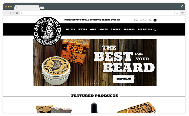
Keep Shopping Cart Visible
You’ve heard the saying “out of sight, out of mind.” In regards to your shopping cart, that saying is one you want to avoid. There are simple design choices you can make to ensure that your cart stands out and is easy to access at all times. One thing you can do is provide enough contrast so the cart stands out in the header. It’s common ecommerce practice for the shopping cart to live in the right-hand corner of your website. An important element to consider is how the cart is styled.
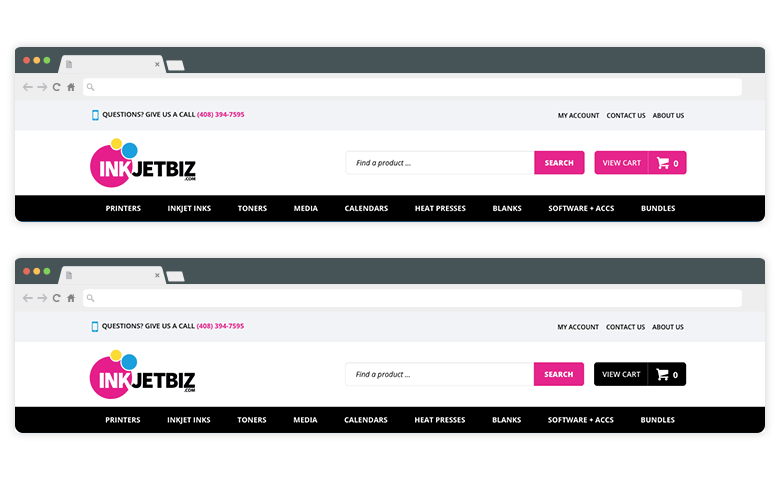
In this example you can see how Inkjetbiz uses their vibrant pink color for the shopping cart button. There is major contrast against the white background and the black navigation area below it. If they were to use a black cart button, it blends in with the top navigation and isn’t as prominent. Making the cart very clear and cohesive with the design is important because it serves as a constant reminder for shoppers to complete their shopping experience.
Utilize a Pop-up
Implementing a pop-up with an incentive to continue the checkout process can be a great way to maximize conversions. Offering a discount to shoppers encourages them to finalize their purchases before abandoning their cart.
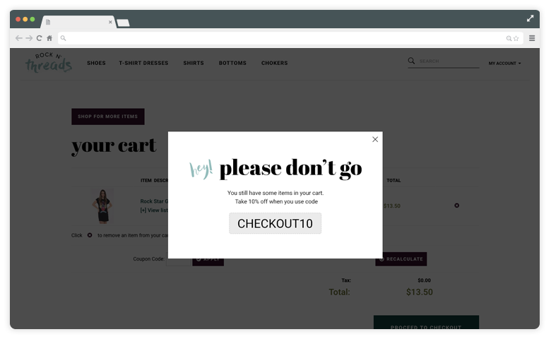
For example, a 10% discount to shoppers lingering in the checkout process could be the difference between making a sale and an abandoned cart. Volusion’s pop-up window service allows pop-ups to be installed onto any page (including the checkout process!) and can be programmed to appear after X amount of time.
Display Security Badges
A study conducted by CIGI revealed that 53% of global users are more concerned about their online privacy compared to one year ago. When customers shop from an ecommerce store—especially one they haven’t shopped with before—they want to know that their personal information can be trusted. Including security badges on your store helps to instill trust and confidence which can result in reduced cart abandonment.
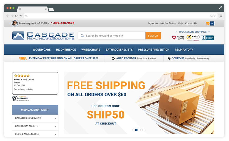
An SSL certificate is another layer of security that benefits your shoppers. An SSL encrypts the data that travels back and forth between your website and your customers, preventing things like stolen credit card information or even malicious code from being run through your site.
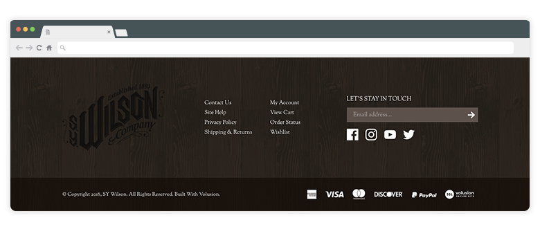
Nowadays, people are accustomed to looking next to the URL in their browser to ensure a website is secure. Most browsers will display a padlock icon or another “secure” message of some sort, but SSL badges in the footer of your website are also a great representation of that added security benefit.
Abandoned carts are bound to occur sometimes, but with thoughtful site elements in place you can reduce the chances and see even see a sales increase.
Have any additional suggestions for reducing cart abandonment? Share your thoughts with us below.


