Choosing colors for a new site may seem daunting at first, but creating a color scheme for your Volusion online store is simple if you follow a few basic principles of color theory when selecting your palette.
What is Color Theory?
Color theory covers a range of topics related to categorizing and mixing colors. You may already be familiar with the Primary Colors: red, yellow and blue. In addition to the Primary Colors, there are Secondary Colors—green, orange and purple—and the Tertiary Colors, red-orange, red-violet, yellow-orange, yellow-green, blue-violet and blue-green. The combination of Primary, Secondary and Tertiary Colors make up the full spectrum of the color wheel. With the right colors—either alone or in combination—you can add personality, emphasis and nuance to your website that will drive traffic and dramatically enhance your brand.
Who is your customer?
Consider your target audience. Colors create a lasting impression with customers as they reinforce the tone of your business and the products or services you sell. To communicate reliability and time-tested experience, consider a more conservative color scheme. Monochromatic tones set the right tenor with customers and prospects by communicating stability. On the other hand, if you offer unique, eclectic goods, your preferred colors may be bolder and fall in the primary category.
How do you Select Colors?
Monochromatic Scheme
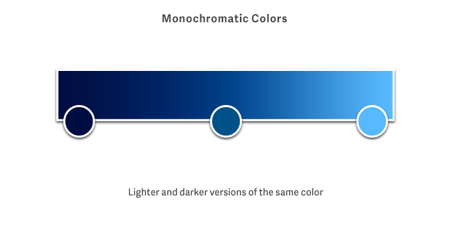
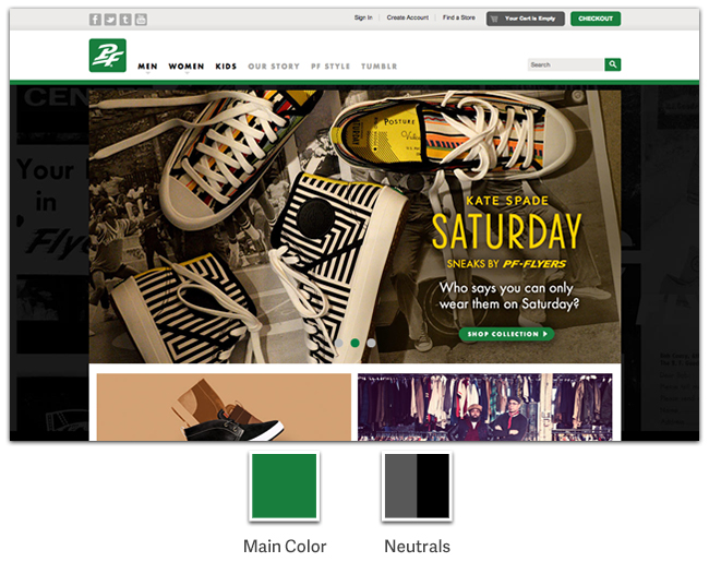
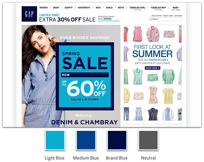
When in doubt, keep it simple! Monochromatic Color schemes are appealing to visitors and easier to implement within a design. Start by choosing a single color as your base, and use lighter and darker variations of that color to add contrast and emphasis throughout your site. Sites like PFFlyers.com (see figure 1a) and Gap.com (see figure 1b) use one strong color to reinforce their brand and accent deals and promotions. The rest of the site relies on photography and shades of grey to provide contrast and emphasis for content. A monochromatic scheme can bring visual harmony to your site and will help you ease into learning to use color in your store design.
Figure 1a
Figure 1bAnalogous Scheme
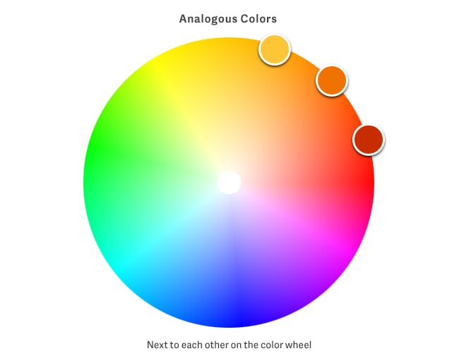
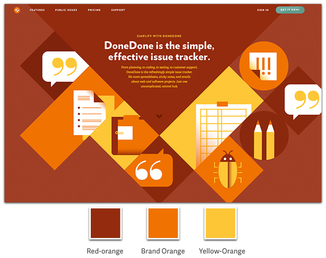
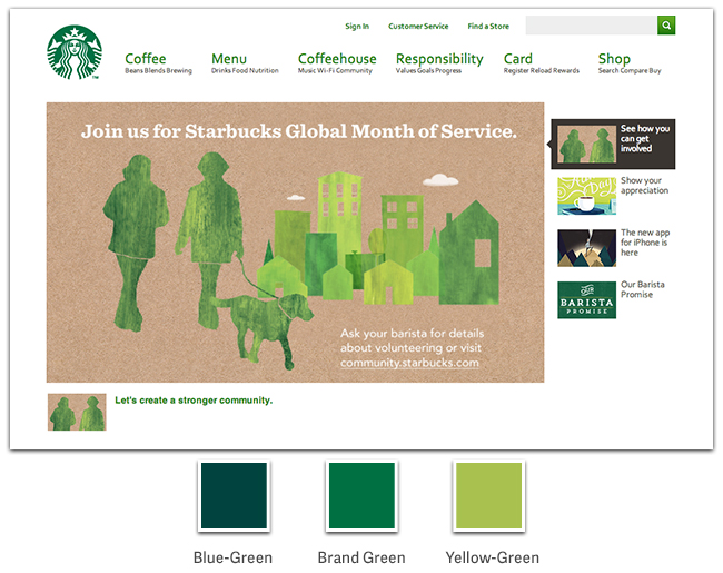
Combining Analogous Colors is another way to simplify your color choices. Analogous colors sit next to each other on the color wheel. Two or three colors, like yellow, yellow-green and green can bring cohesiveness and a playful range of hues to your site. You might choose to use the brightest color to emphasize selling points and purchase opportunities. GetDoneDone.com (figure 2a) and Starbucks.com (figure 2b) make excellent use of analogous colors to direct customers’ eyes to important content. Analogous colors create visual harmony, but are more muted than colors on opposing sides of the color wheel. With varying intensity and saturation, Starbucks’ unique shade of green is grouped with yellow-greens and deep blue-greens that resonate with the brand and add variety that doesn’t feel chaotic.
Figure 2a
Figure 2b
Complementary Scheme
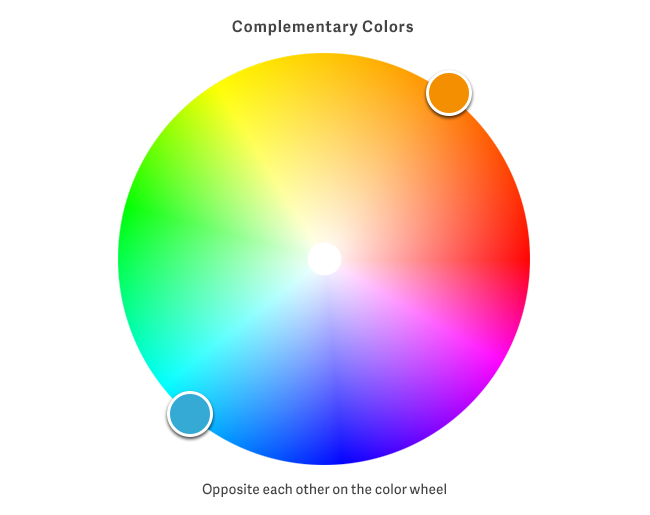
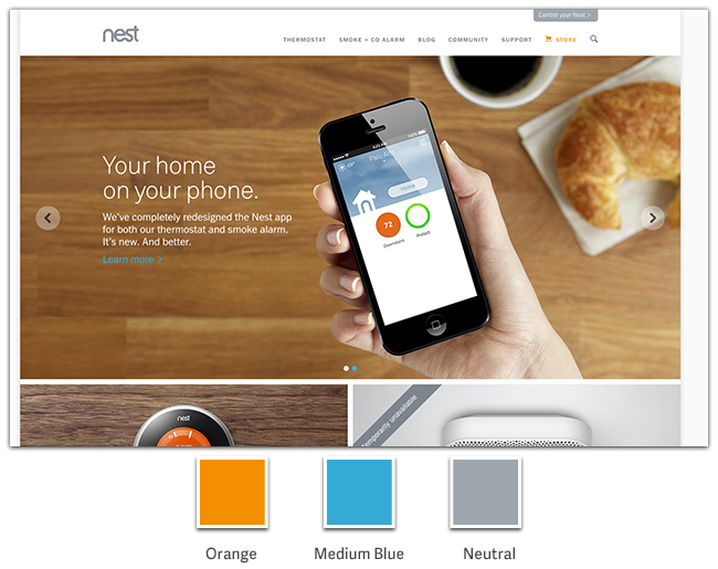
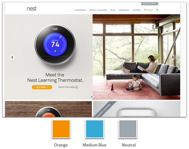
To create strong contrast, pair Complementary Colors like red and green, orange and blue, or yellow and purple. This example from Nest.com (figure 3a and 3b) shows how cool blues helps anchor text and illustrations on the page, while the vibrant complimentary orange boldly directs your eye through the content. By using a bright orange against blues and neutrals, you can help your customers find products and quickly add them to their cart with a vivid call-to-action button.
Figure 3a
Figure 3b
When combined thoughtfully, colors can add vibrancy and contrast to your site while also creating an overall impression of harmony on the page. In every sense, colors can set the right tone for your customers’ shopping experience.
If you’re interested in reading more about combining colors to improve sales, check out this great overview from Kissmetrics. In addition, Colour Lovers offers an array of inspiring palettes and guides for choosing color combinations.


