Knowing when to use animated effects in your store's web design is more art than science. Read on to see the five contexts in which animations improve your website's overall user experience.
User experience is an important consideration for keeping customers engaged on your website and with user experience comes the subject of web animation and transition effects. The modern browser allows us to bring the web to life using HTML, CSS, and JavaScript.
At a certain point, however, these features can be excessive. Have you ever seen those PowerPoint presentations that seemed to have utilized every transition effect that the software offers? A similar trend has started to emerge on the web. It isn't a matter of can you do it, but should you do it.
What are animations?
For the purposes of this post, web animations refer to the various transition effects mainly performed by CSS and sometimes jQuery/JavaScript. These effects can be anything from a simple color fade to a zoom-in effect on an image. Basically, it's any stylistic change of an element from one state to another.Today’s tools allow us to easily implement animated effects, but the key is knowing how and when to use them. Adding too many effects can distract the user from her end goal and can also increase the page load time; both of which can wear down the patience of your user.
Spare the snowflakes
Think back to sites you’ve visited with way too many animations. First, a popup fades into your screen prompting you to sign up for a newsletter. You close that box only to find that the site you're visiting has snowflakes floating down the screen to promote a winter sale. You click on a product and wait endlessly for the page (and all its snowflakes) to load. This is a perfect example of what not to do.
When should you use animations?
Animations can be the icing on the cake to a beautiful website. When executed correctly, they can even enhance the overall user experience of your website. The key is to make sure you use them for a purpose.Here are five reasons to add an animation to your store:
1. To focus
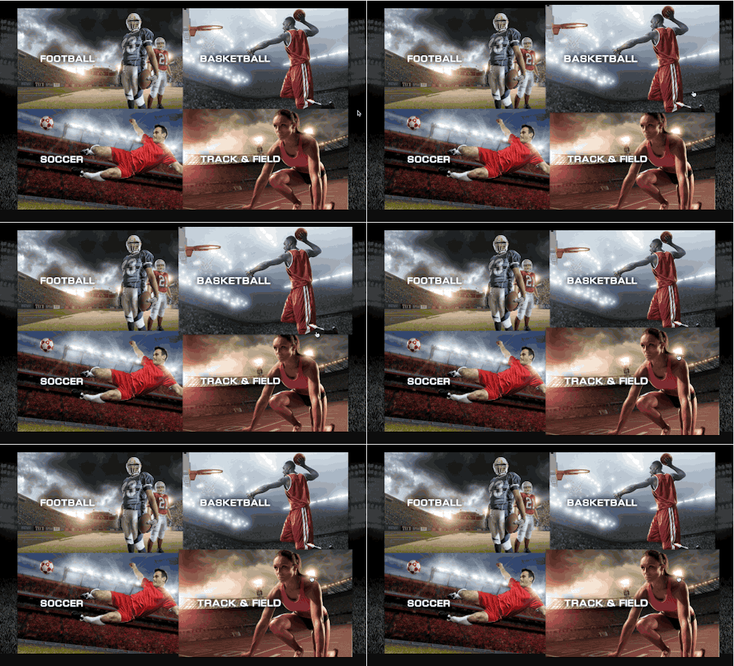
The transition effect used here helps isolate the image for each sport and helps direct the user’s attention.
2. To hint

This hover effect gives the user further information about the color swatch by identifying the specific color name.
3. To notify
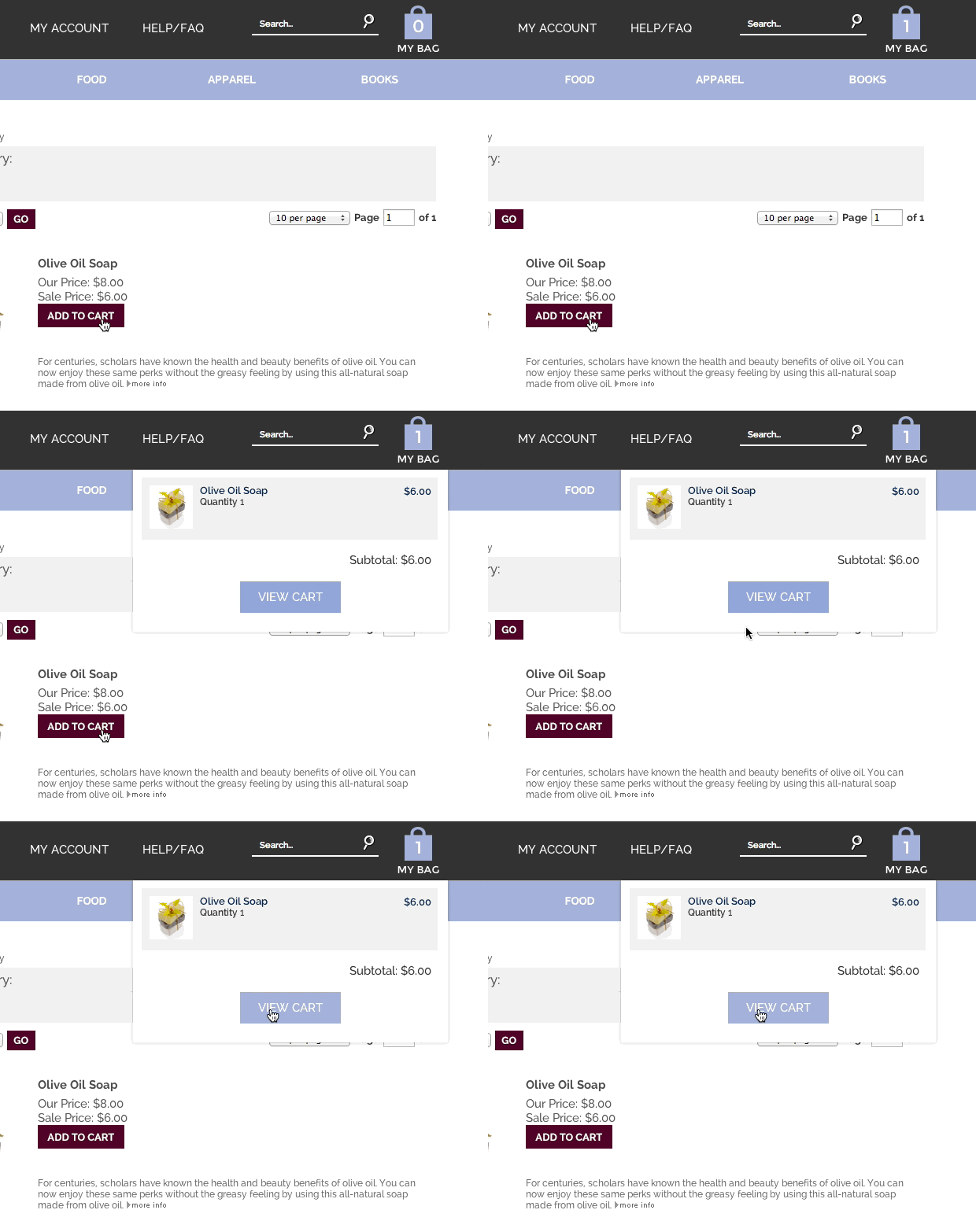
This add-to-cart dropdown effect helps to notify the user that an item has been added to their cart.
4. To react

5. To orient
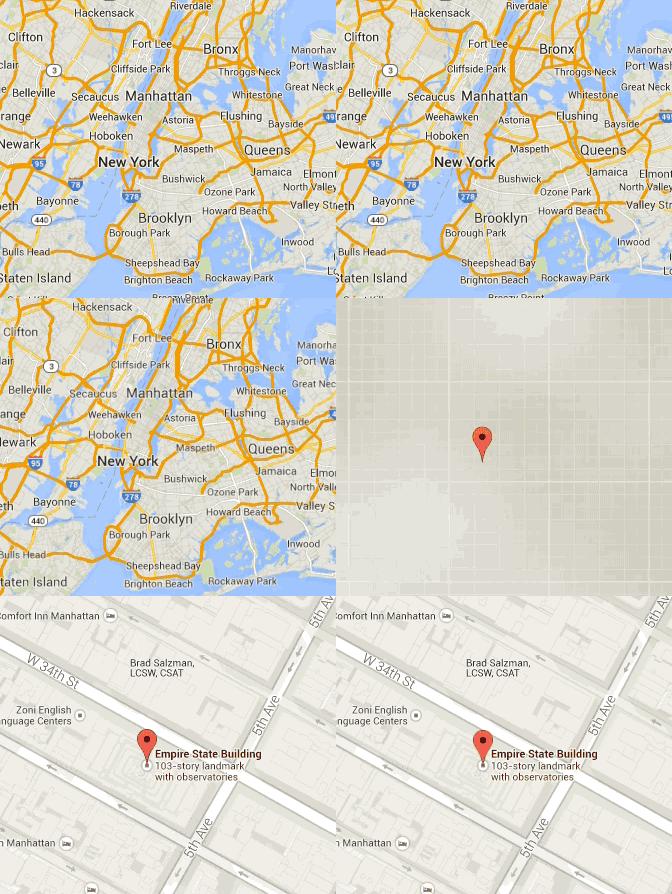
This Google map is a perfect example of how a simple zoom effect can enhance the user’s ability to get oriented on the page.
Overall, if you want to use an animation that in any way hinders users from accomplishing what they want on a site, don’t. If you’d like to add an animation that will enhance the overall experience of visiting a website, go for it!
Happy selling!
-Ashley Hebler, Volusion
