When it comes to ecommerce website design, the look and feel of your site are both very important to the customer experience. Therefore, choosing the right design approach is critical to running a successful ecommerce website.
There are two popular design techniques you can implement on your ecommerce site—minimalism and maximalism. The two are complete opposites of each other and deliver a very different look and feel. The question is, which one is better for ecommerce design?
This article will explain the differences between minimalism and maximalism and help you choose the best design backdrop for your digital store.
What Is Minimalist Ecommerce Design?
Minimalism is a design approach based on the idea that less is more. It aims to keep your website as simple and clear as possible while minimizing distractions for your site visitors. The lack of distractions focuses the spotlight on what you want your visitors to look at.
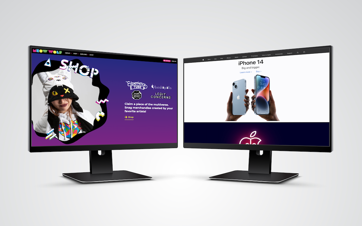
Apple’s website is a great example of minimalist design. All the attention is on the product the company wants to highlight, without any unnecessary elements taking away focus.
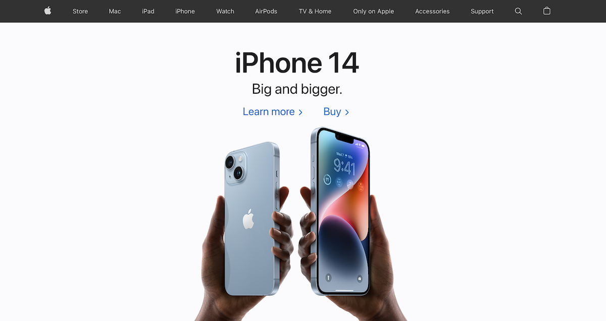
Minimalist design is characterized by a scarcity of elements, simple lines, neutral and balanced colors, flat backgrounds, and clean, simple, and distinctive fonts. It also uses lots of white space, which helps to accentuate the elements that break the visual silence.
Pros of Minimalist Ecommerce Design
- Easy navigation: Since there are no distractions, your site visitors can easily figure out the action you want them to take. This provides a better user experience for your visitors and increases conversions.
- Straightforward communication: A minimalist approach helps you convey your brand message to your visitors quickly and clearly. Readers don’t have to try too hard to identify your value proposition.
- Faster load times: According to Google, increasing a website’s load time from one to three seconds leads to a 32% increase in bounce rate. Minimalist ecommerce websites have minimal elements, which translates to faster load times and lower bounce rates.
- Better SEO: Minimalist sites don’t have much clutter, so it’s easier for search engine bots to crawl through them. This can improve your search rankings and help you attract more traffic.
- Easier maintenance: A minimalist website has fewer individual elements, which makes it easier to maintain and less likely to break.
Cons of Minimalist Ecommerce Design
- Limited communication: Minimalist design limits you to a few words and images, which can sometimes make it challenging to convey all the required information to your visitors.
- The risk of being boring: Without many elements to capture the eye, there’s always the risk that some people might see your website as boring.
What Is Maximalist Ecommerce Design?
Whereas minimalism believes that less is more, maximalist design works on the concept that more is better. Rather than focusing only on the essential elements, it tries to wow visitors and overstimulate their senses with a mixture of design elements, colors, and styles.
Maximalist design is characterized by a mix and match of fonts and styles and vivid colors. Instead of white space, maximalism tries to utilize all available space by filling it with content and elements, including text, images, and video.
Meow Wolf’s website is a good example of a website based on maximalist design principles. Rather than drawing the eye to a single element, it has multiple elements and exciting animations trying to get your attention and move you through the page.
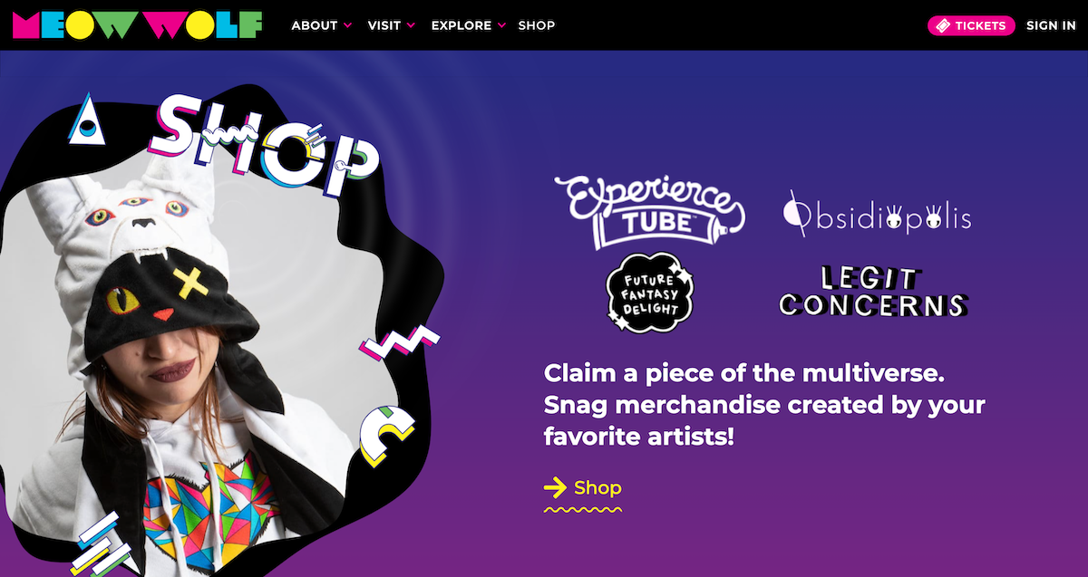
When done poorly, maximalist design can make a website overwhelming for your visitors, leading to a high bounce rate and reduced conversions. Therefore, if you opt for this approach, you should ensure that all the elements on the website add value to the user experience.
Pros of Maximalist Ecommerce Design
- Loud and bold: Maximalist design allows you to showcase your brand loudly and boldly without any restrictions. It is an excellent choice for ecommerce brands that want to present themselves as youthful and energetic.
- Unlimited communication: With a maximalist design, you don’t have to oversimplify things. You can use multiple elements—including images, video, and text—to pass your message. This makes it easier to communicate your value proposition and ensures that your site visitors fully understand what you’re offering.
Cons of Maximalist Ecommerce Design
- Can be distracting: Without proper planning, a maximalist ecommerce site can become too distracting and overwhelming for your visitors. It becomes harder to direct their actions, leading to decreased conversions.
- Difficult to maintain: The high number of elements in a maximalist site can increase the likelihood of something going wrong. Changing a single thing can easily affect everything else, making such sites harder to maintain.
Which Approach Is Better for Your Ecommerce Website?
Choosing the right design approach is essential when setting up your ecommerce business—almost as crucial as strategically choosing where to set up your company. In Texas, for example, sole proprietors don’t need to pay franchise or corporate taxes, which can have a massive advantage for your business. Similarly, choosing an appropriate design technique to match your brand gives you great benefits.
The minimalist approach is a good choice for ecommerce brands that want to communicate maturity and elegance. It is suitable for well-established ecommerce brands and those selling exclusive luxury items, such as expensive wines, watches, and jewelry.
The maximalist design approach, on the other hand, is an excellent choice for ecommerce brands that embody youthfulness, energy, and excitement. It works well for digital shops selling sports merchandise, art-related items, youthful fashion items, etc.
Wrapping Up
Ultimately, the choice between minimalism and maximalism isn’t about deciding which of the two is superior. It’s about figuring out which one works better for your brand. Therefore, you should make this decision based on your brand’s ethos and values.
More importantly, building a successful ecommerce website goes beyond the design approach. Whether you choose minimalism or maximalism, you must ensure that your ecommerce site is designed to deliver an excellent user experience.


