
Are you filled with envy because you wish you could take killer pictures like the ones you see on your social media feeds? Truth is, you don’t have to be a graphic designer or a professional photographer to create cool images like your favorite blogger.
To help you craft your social media persona like a pro, we’ve provided a quick guide featuring creative tips, free photo editing resources and more. After reading this you'll be the one making other brands envious of your social skills.
Make Your Social Media Profiles Look Great
First things first: start by enhancing your profile images. The images and content featured on your social media profile are not only a direct reflection of your brand, but they can also be a good indicator of the quality of your offerings. You want to make sure that you are delivering a strong brand message, and nothing helps this more than having high-quality profile images.
1. Profile Pictures
It’s almost always considered a best practice for your business profile’s main picture to feature your logo. Make sure that your logo is clear and easy to read, and avoid using any type of design or images on or behind the logo itself. Having logos as profile picture tends to give businesses (especially startups) more credibility. It’s an easy way for people to identify your business as such, and differentiate it from personal profiles or even spam.
2. Cover Photos and Headers
Cover photos offer a great opportunity to show on a broader level what your business is about. Since they are the biggest images (literally, dimension-wise) featured on your profiles, they can be the most distracting item for a viewer. For this reason, it is very important to use an eye-catching image that will portray the core message of your brand. To ensure better quality and simplicity, avoid using text or any type of graphics on the image. The only occasion where it's OK to use text or clean graphics on the cover photo/header would be to promote a particular event or sale. Other than that, avoid it as much as possible.
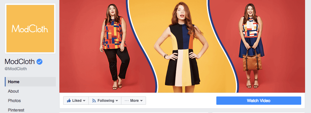
Both profile and cover pictures should be changed periodically, especially with the change of seasons, holidays, new merchandise arrivals and special events. If you’ve had the same profile images for over two months, now is a good time to upload new ones. Keep in mind that for stronger branding, it is important to be consistent and show cohesiveness throughout your profiles. This means that if you change the cover photo on Facebook, make sure that you also change the image for Twitter and that they are both the same image.
Another thing to keep in mind when creating high-quality profile images is to always take into consideration each social media channel’s most current sizing and formatting requirements. These factors always play an important role in affecting the quality of images. Sprout’s Always Up-To-Date Social Media Image Sizes Cheat Sheet is an easy way to find out if you are using the right image dimensions and Pic Resize is a great tool to resize any images you might have. The last thing you want is for a good image to look overstretched or tiny!
How can you make pictures look amazing?
First, you should create a content schedule. Just like it sounds, a content schedule is basically all of the content you plan to feature throughout a period of time, organized into a document of your choice. It’s just like taking notes in college: everybody has a different style of doing it. If you aren’t sure how to go about creating one, here's a great resource that provides templates for you to download. Organizing your content not only helps you plan a strategy, but also enables you to be consistent in posting.
From my experience in working with a variety of brands and in different industries, I've complied what I consider to be the eight principles of creative:

1. Use simplicity. Simple is the new beautiful. Long gone are the days of tacky advertisements. When taking pictures of your merchandise, keep things crisp. Don’t be afraid to feature a single item on a plain and well-lit background, like Hieleven demonstrates here.

2. Contrast colors. Make sure to use contrasting colors in all of your images, like Jane Ko does. Doing this makes it easy for the eyes to navigate through a picture and focus attention on particular items.

3. Craft a good story. The most successful brands are the ones that craft a lifestyle concept around the message they’re trying to deliver. This gives people something they can emotionally relate to. With a little bit of grace, narration and artistic value, you can use images to tell your brand’s story. Refrain from only posting images about your services or products. Think on a larger level, and identify other things that relate to your business, like Beardbrand does on their Instagram.
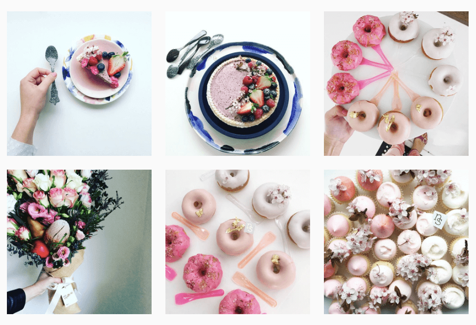
4. Adopt an overall theme. Creating an overall theme for your images can provide consistency and help reinforce your brand identity. It can also make it easier for people to quickly familiarize themselves with your brand. You can create an overall theme for your images in many different ways. For example, some people use the same photo filter, while others use a particular angle or color for all of their images. Nectar and Stone does a great job of this in their feed.
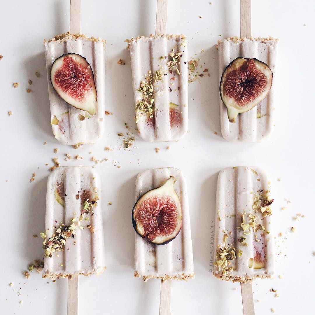
5. Use strong symmetry, focal points and balance of objects. When photographing various items, for strong symmetry try to use the rule of thirds. Doing this will help to place focus on particular items and balance objects. This is especially good to remember when photographing multiple products. Check out The Pink Diary for some good examples.
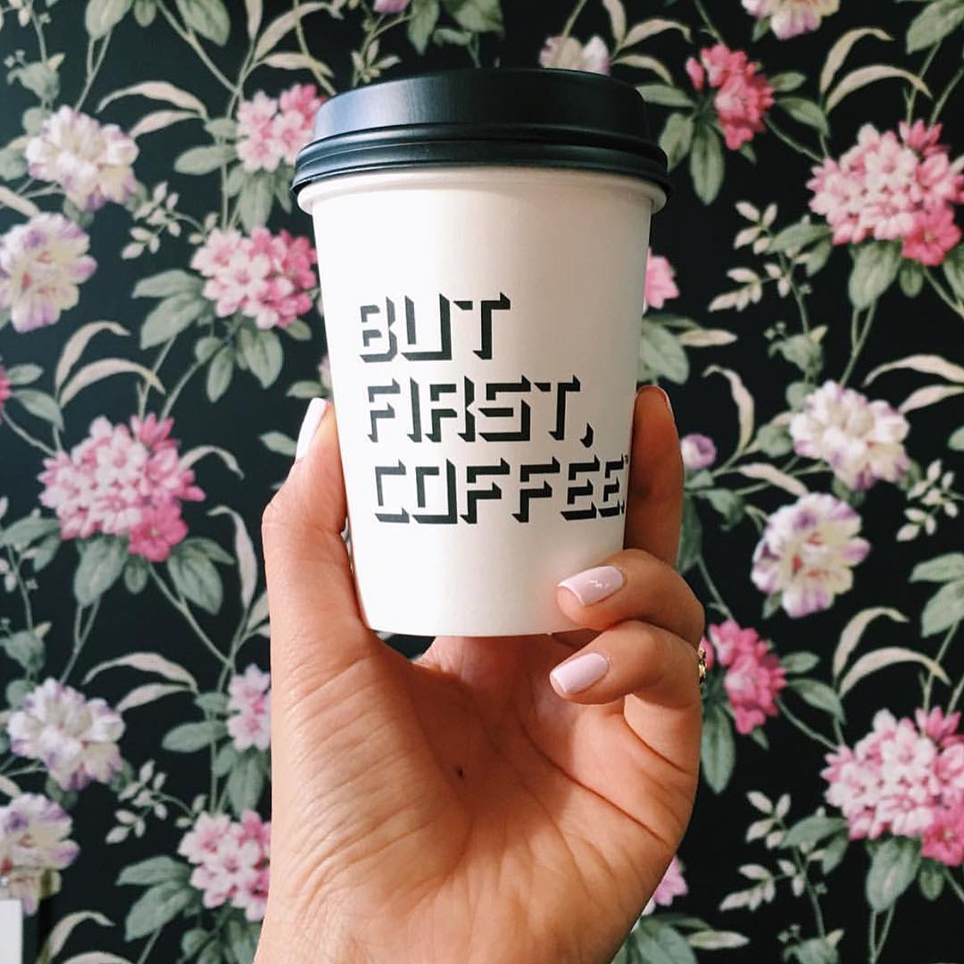
6. Include people in your images. Nothing inflicts more emotional appeal than images of people. For example, even if you’re just photographing a cup of coffee, add some life to the image and photograph a hand holding the cup, like Alfred Coffee did. This adds a certain relativeness and will be perceived more warmly than if it was just a shot of the cup itself.

7. Take action shots. Another way to grab attention and inflict emotion is through action shots. For example, if your business sells cake mixes, take a picture of someone that’s in the process of combining the ingredients or baking a cake. Yeti combines both a lifestyle image and an action shot in their snap above.

8. Mix it up. Use different styles of photography or content. For example, experiment by using different picture layouts (such as a flat lay) or integrating video into your feed. It will make things more entertaining and drive higher levels of engagement with your target group! Scope Refinery29 for some great inspiration here.
Free Resources Are Blowing Up the Internet
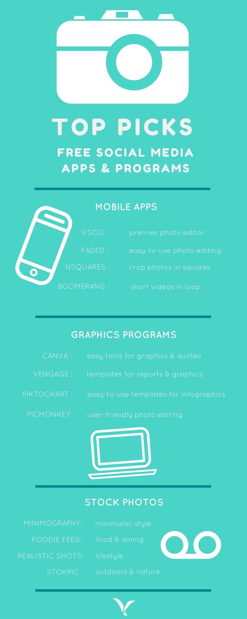
What happens if you don’t have the resources to make your pictures high quality, or if you’re unable to shoot your own images? Not to worry: the internet is inundated with free resources. Below is a graphic featuring some of our absolute favorite (and free) mobile apps for editing pictures, programs for creating graphics/flyers/quotes and sites that offer free stock photos.
Do you have any advice for running an awesome social page? Let us know in the comments!


