Ecommerce business owners spend a significant amount of time and attention on the core pages of their sites, especially the homepage and product pages. Considering that these pages typically convert the highest, this strategy is understandable. Surprisingly, however, many online store owners miss out on conversions by not including their 404 page in optimization plans.
Regardless of how clean you keep your URL structure and redirect profile, customers will still try to access pages on your site that don't exist—whether by typing in the wrong web address or by clicking a broken link that you haven’t had time to redirect yet. By optimizing your 404 page, you can steer wayward travelers back in the right direction, indirectly improving your conversions.
What is a 404 Page?
A 404 page is an error page (or a “Not Found” page) that appears if a visitor clicks on a link or types in a URL for a page that doesn’t exist, or has been moved or deleted. Essentially, if a 404 page appears, that means the website is active, but the page is not.
If you spend much time browsing the internet, it’s likely you’ve encountered your fair share of 404 pages. This can be pretty frustrating, especially when the default 404 page offers you no explanation or way to get back into the site you were just browsing.
For large websites with a lot of pages, it can be difficult to avoid 404 pages entirely. When possible, site owners should limit the number of 404 error pages that are found across their website, as they usually deliver a poor user experience and are seen as low quality by search engines.
The Two Types of 404 Pages
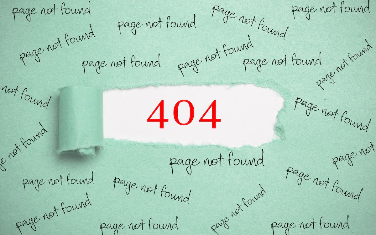
There are two types of 404 pages: custom and default. Without a custom 404 page, visitors reach the browser’s default error page, which doesn’t offer any options for remaining on the site and can easily result in lost visitors—and lost sales (for ecommerce sites). Frustrated visitors, unable to find a path to their desired page, will often back out of the site entirely and go to a competitor’s. The default 404 page looks something like this:
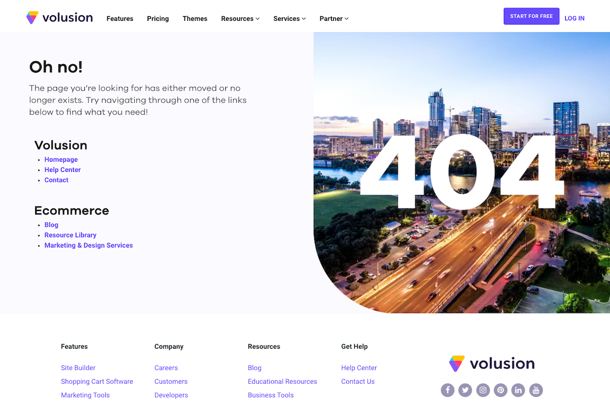
A custom 404 page matches the rest of the site, may explain how the visitor got there, and may link to other popular products or related pages to encourage users to keep shopping or browsing. A custom 404 page allows you to keep visitors on your site rather than just bouncing to another. Here is an example of a custom 404 page:

Image Source
Having a custom 404 page in place instead of relying on the default 404 page is good practice for any website, even if there are no broken links, because there is always a risk that users will mistype the name of the website.
Key Features of a Custom 404 Page
There are a few main elements that each custom 404 page should include to ensure an optimal user experience. You can learn a little more about each point below:
1. Matches the design and tone of the rest of your site
Even though this page is alerting visitors of an error, it should appear cohesive with the rest of your website. To do this, make sure that the design, tone, and corresponding elements present on the page align with your brand. Taking this step will give visitors peace of mind that they have not been thrown into some other, less-secure section of the internet, but rather just a different area of your site that they’re already comfortable with.
2. States clearly that this is NOT the expected content
Not all customers are familiar with 404 pages and, upon arrival, may not know that there is something wrong. Minimize confusion by letting visitors know that the page they were trying to access is missing with a big, bold heading. This way, it’s abundantly clear that the reason they are seeing this page is the result of an error, rather than the page content just being entirely different from what they were searching for in the first place.
3. Explains succinctly how the user ended up here
Once you’ve made it clear that the page is appearing because of an error, tell customers how this may have happened in the first place. Explain that they've either come to a page that no longer exists or that they've mistyped the URL so that they won’t wonder why they ended up on this page. To soften the experience, try to insert some humor to reassure your customers that unexpectedly arriving at this page is no big deal.
4. Directs users to other helpful areas of your site
Don't leave customers stranded on this page! Instead, provide specific calls-to-action that steers customers back to the important pages on your site. The most common approach is to send them back to your homepage, but you can also consider driving them back to key category pages that are unlikely to change. This can help you retain shoppers on your online storefront rather than driving them to search the web for an alternative.
5. Maintains your site’s navigation menu and search bar
Finally, ensure that the navigation tools available on other pages of your site—like a search bar and top navigation menu—are available on this page as well. Upholding this functionality both assures the customer that they are still on the same website AND gives them a plethora of other linked page options to look through quickly so that they’re not tempted to jump ship. This simple step will also help you maintain your site’s branding on this page.
In Conclusion
While your 404 page may not be your top priority in terms of web design, it should be included on your list of pages to pay attention to. When approached correctly, an effective 404 page minimizes confusion to your customers, keeps them on your website so that they can continue shopping, and reinforces your branding.


