In this how-to guide, we will add new Element Proptypes to an existing Element Block React Component and organize them using an Element Proptype sectionHeader.
Open up your block's code and find /src/configs.js. It will look something like this:
import { ElementPropTypes } from '@volusion/element-proptypes'

export const configSchema = {
  text: {
    label: 'Text content',
    type: ElementPropTypes.string,
 },
}

export const defaultConfig = {
  text: 'Element Starter Block',
}
Add another proptype to the schema. You will need to provide a label property and a type. For this example, we'll add a textColor prop with a PropType of color, but look at the "Proptypes" reference for other available types.
import { ElementPropTypes } from '@volusion/element-proptypes'

export const configSchema = {
  text: {
    label: 'Text content',
    type: ElementPropTypes.string,
 },
  textColor: {
    label: 'Text color',
    type: ElementPropTypes.color,
 },
}
When you add a new Element Proptype to a schema in config.js, you need to give it a default value:
export const defaultConfig = {
  text: 'Element Starter Block',
  textColor: 'rgba(130,104,252,.8)',
}
We can now use that new proptype in the block. Open /src/Block.js and add a style attribute to the <h1> tag assigning our new textColor prop to the color.
<h1 style="{{color:" props.textColor}}></h1>
Return to /src/configs.js and add another prop: backgroundColor.
import { ElementPropTypes } from '@volusion/element-proptypes'

export const configSchema = {
  text: {
    label: 'Text content',
    type: ElementPropTypes.string,
 },
  textColor: {
    label: 'Text color',
    type: ElementPropTypes.color,
 },
  backgroundColor: {
    label: 'Background color',
    type: ElementPropTypes.color,
 },
}
Group the colors together under an ElementPropTypes.sectionHeader:
import { ElementPropTypes } from '@volusion/element-proptypes'

export const configSchema = {
  text: {
    label: 'Text content',
    type: ElementPropTypes.string,
 },
  colorsHeader: {
    type: ElementPropTypes.sectionHeader,
 },
  textColor: {
    label: 'Text color',
    type: ElementPropTypes.color,
 },
  backgroundColor: {
    label: 'Background color',
    type: ElementPropTypes.color,
 },
}
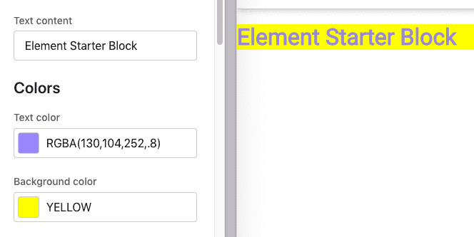
Update the default configs to include the new props:
export const defaultConfig = {
  text: 'Element Starter Block',
  colorsHeader: 'Colors',
  textColor: 'rgba(130,104,252,.8)',
  backgroundColor: 'yellow', // merchant changes are stored in RBGA
}
Go back into /src/Block.js and update the style of the <h1> to use our new property:
<h1 style={{color: props.textColor, background: props.backgroundColor}}>
Build and update your block:
npm run build
element update
Add your block to a theme, or reload your theme with the block, and you'll see the new props and default values grouped under the "Colors" sectionHeader: